Conceptual Signage Design for Shenzhen Subway Stations
B
P
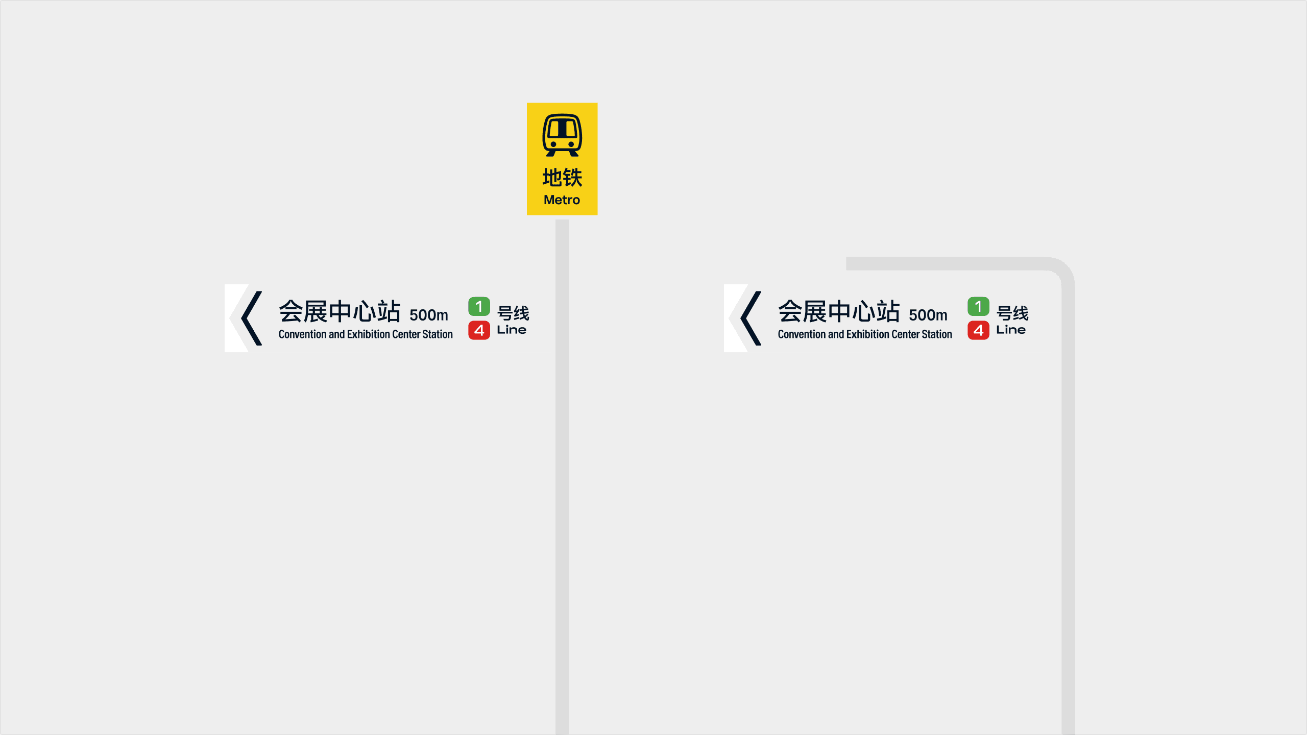
The Shenzhen Metro wayfinding system serves tens of millions of daily commuters. Exceptional public wayfinding design does not rely on complex visual expression; rather, it assists people in finding the correct direction in the shortest possible time. By rethinking information hierarchy, visual identity, and system consistency, we seek to explore a wayfinding language that is better adapted to the future of urban rail transit development.
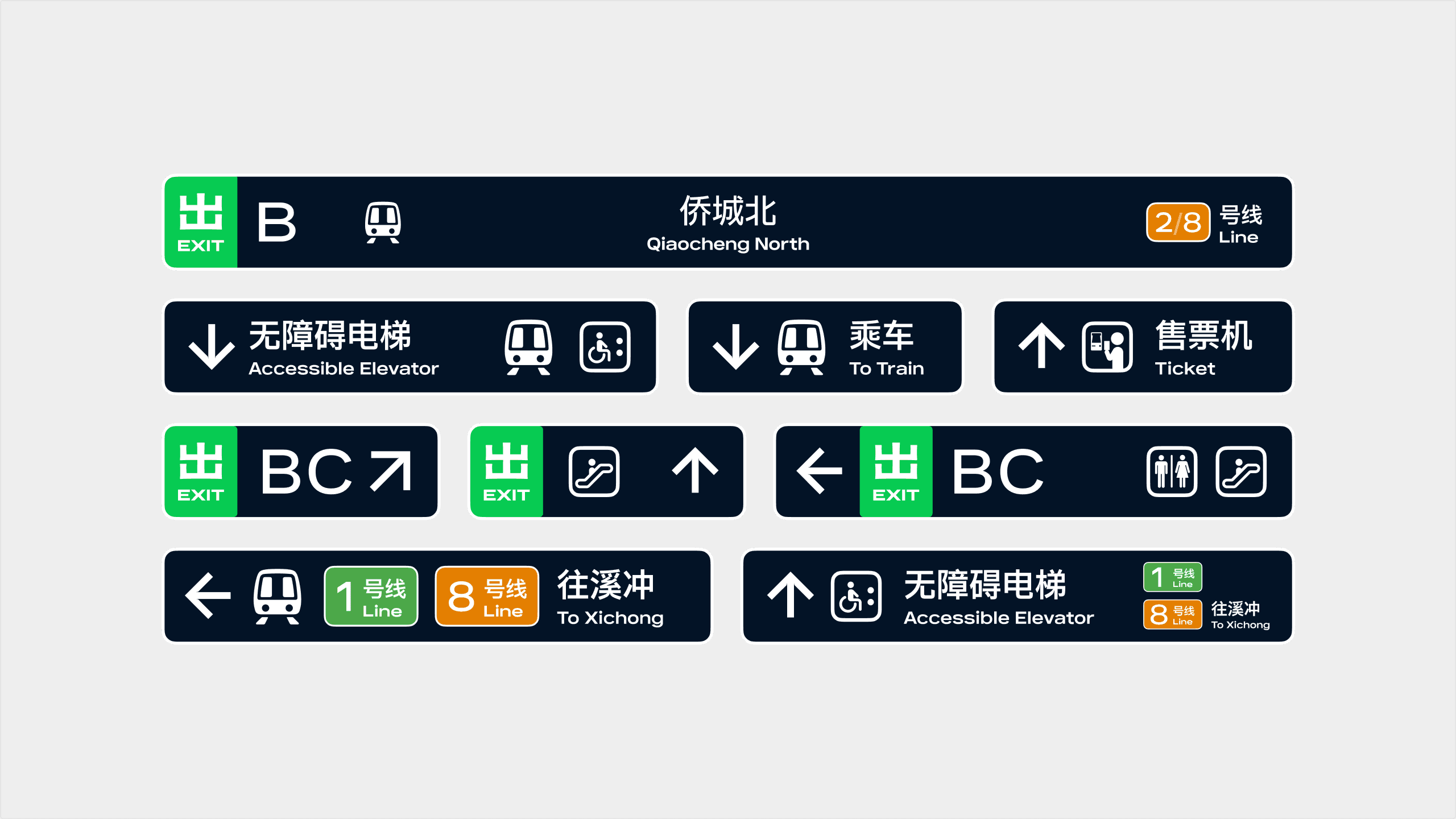
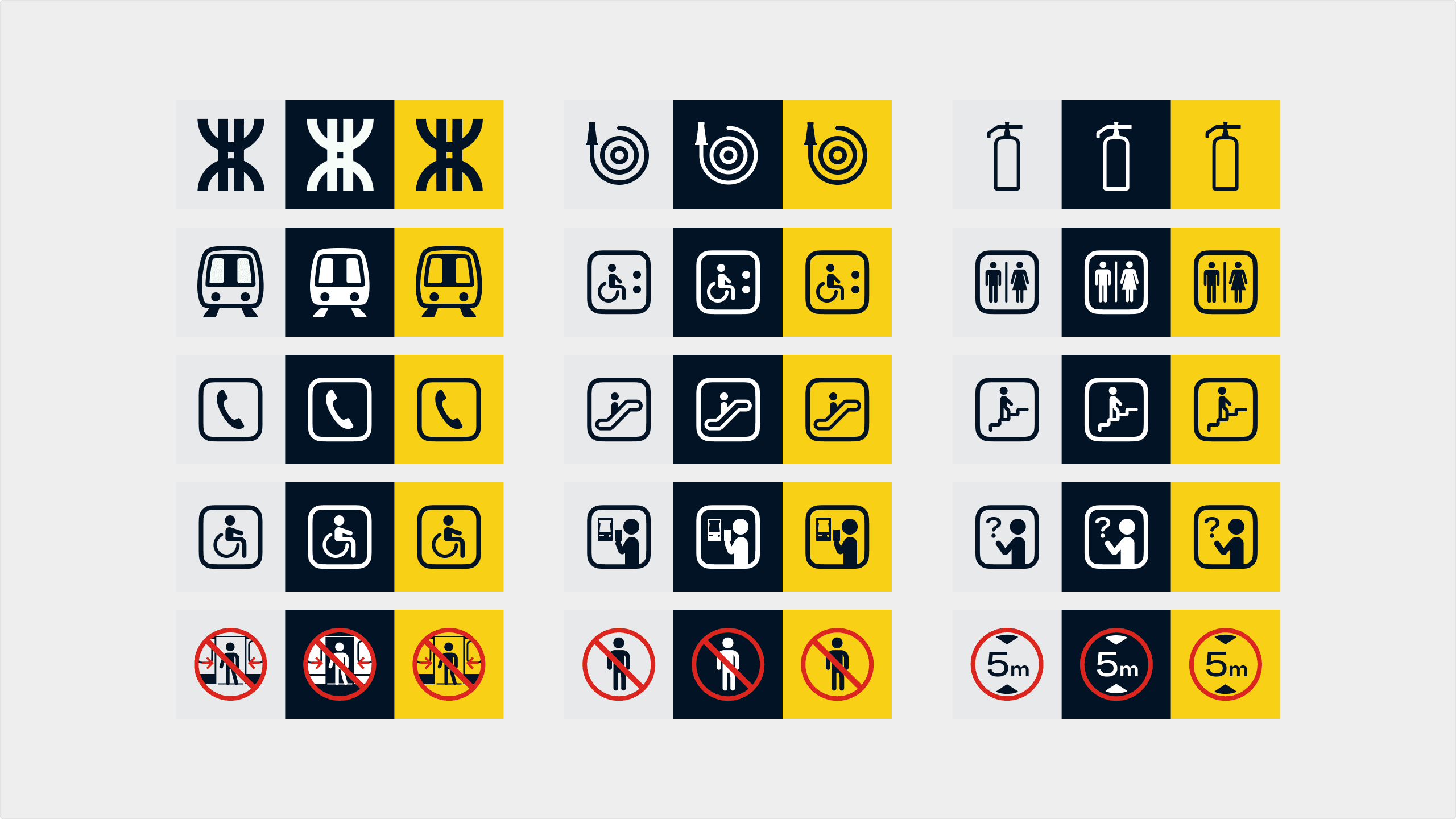
The current Shenzhen Metro wayfinding system generally adheres to national standards and is functionally mature. As the network continues to expand, information density increases, and user reading habits evolve in the mobile internet era, certain signage systems have begun to reveal challenges in recognition efficiency, information hierarchy, and visual consistency. Building upon the existing framework, this concept design systematically optimizes high-touch signage within stations, exploring further possibilities for the future of the Shenzhen Metro wayfinding system.


Exit Signage
While maintaining a high degree of continuity, we have endowed the classic exit symbol with a visual character more aligned with contemporary design language. Preserving the original symbolic structure and public familiarity, we refined the curvature of the strokes, the treatment of the corners, and the overall proportions. The new exit graphic reduces the harshness of mechanical chamfers, resulting in more natural and fluid connections between strokes, and delivering a more consistent, stable presence across both digital screens and physical signage.
Print Layout
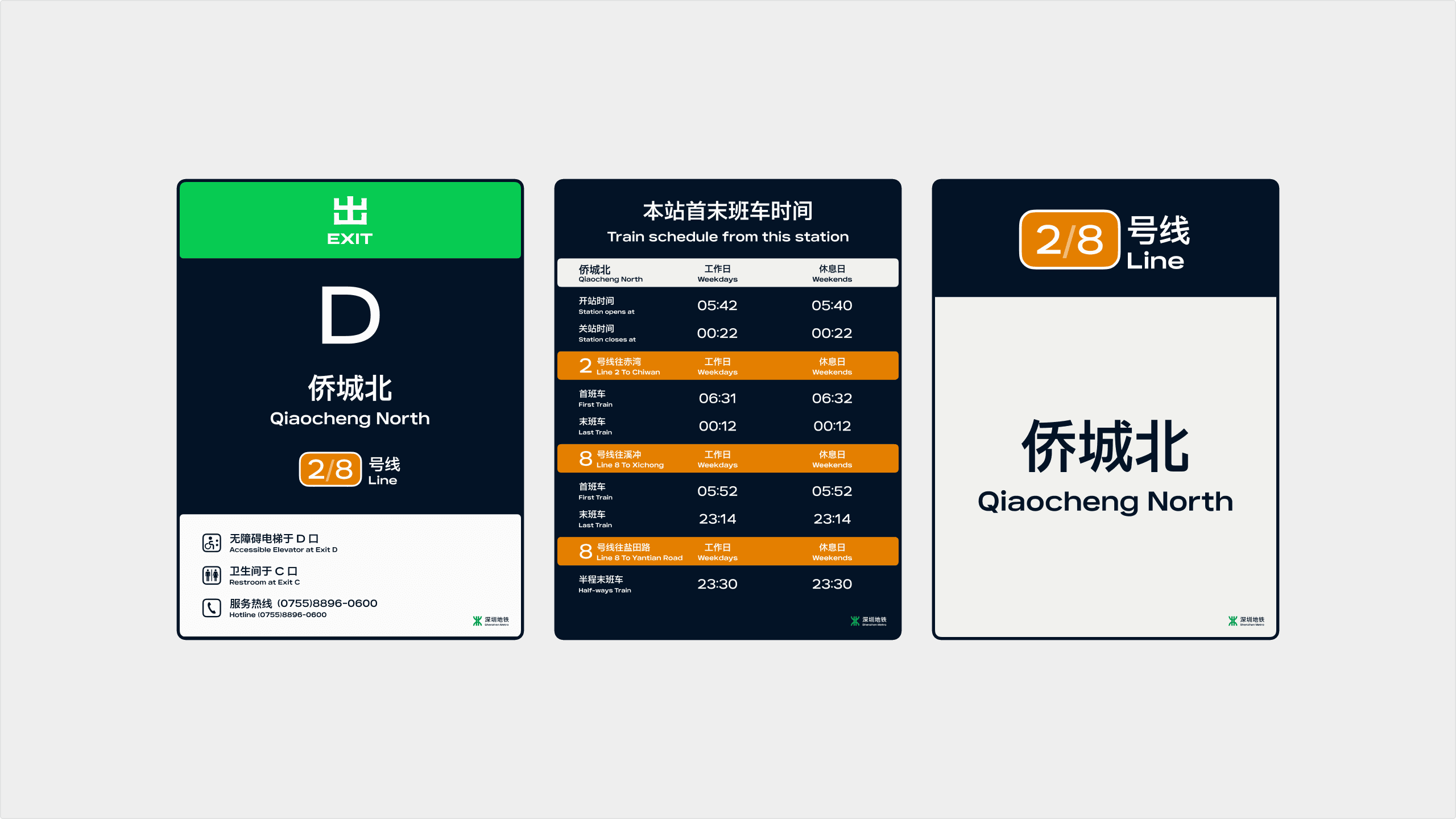
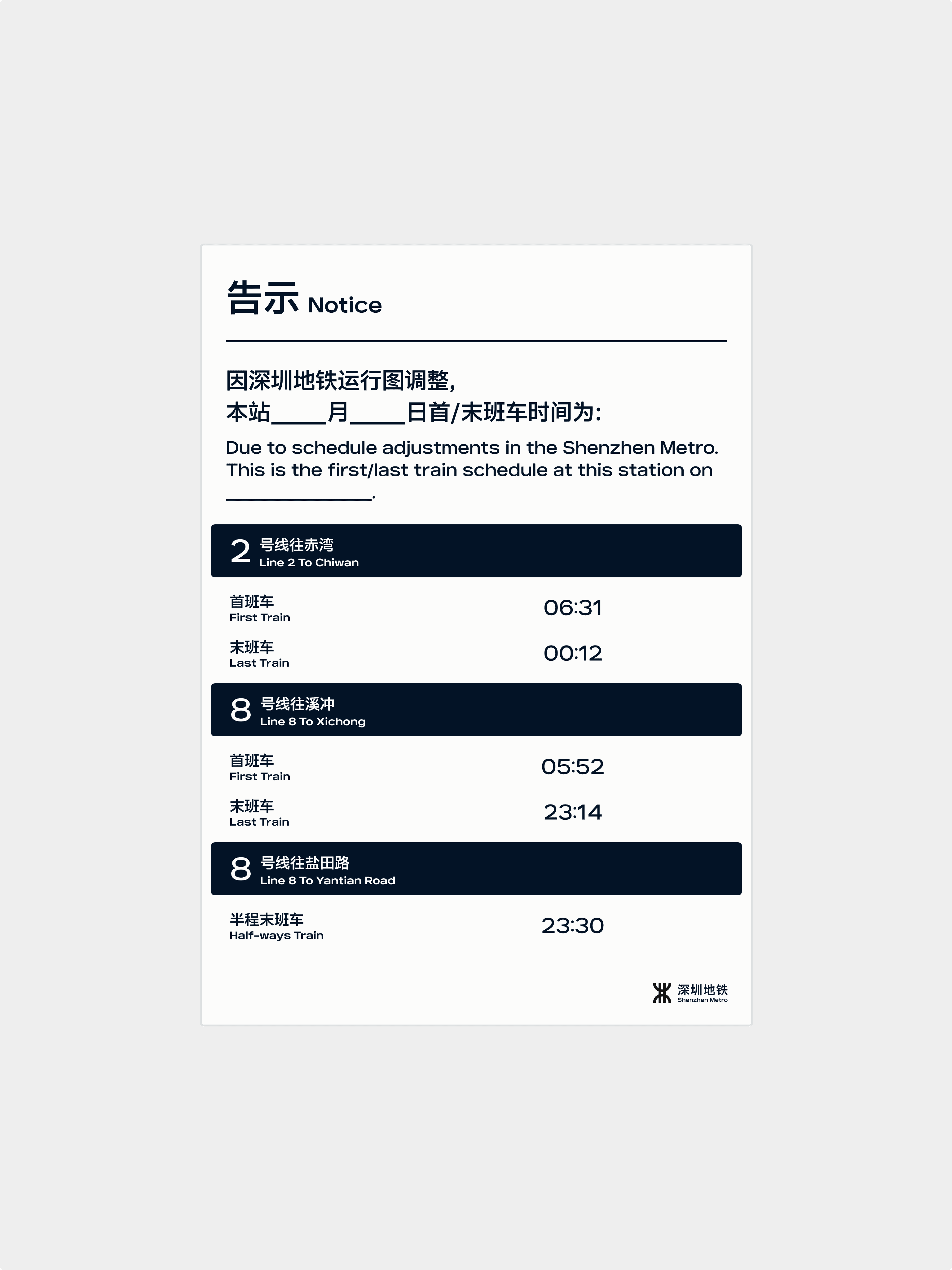
Printed materials such as timetables, announcements, and temporary notices are often the primary sources of visual clutter within stations. Many information templates have long relied on incongruous design standards established in different eras, leading to fragmented hierarchies, unbalanced information density, and a lack of layout continuity. We have established a unified template system, bringing station names, lines, scheduling, and operational information under a cohesive, singular typographic logic.