
Besign Walk Osaka: Order in restraint, warmth in details.
Besign Walk
6/6/25
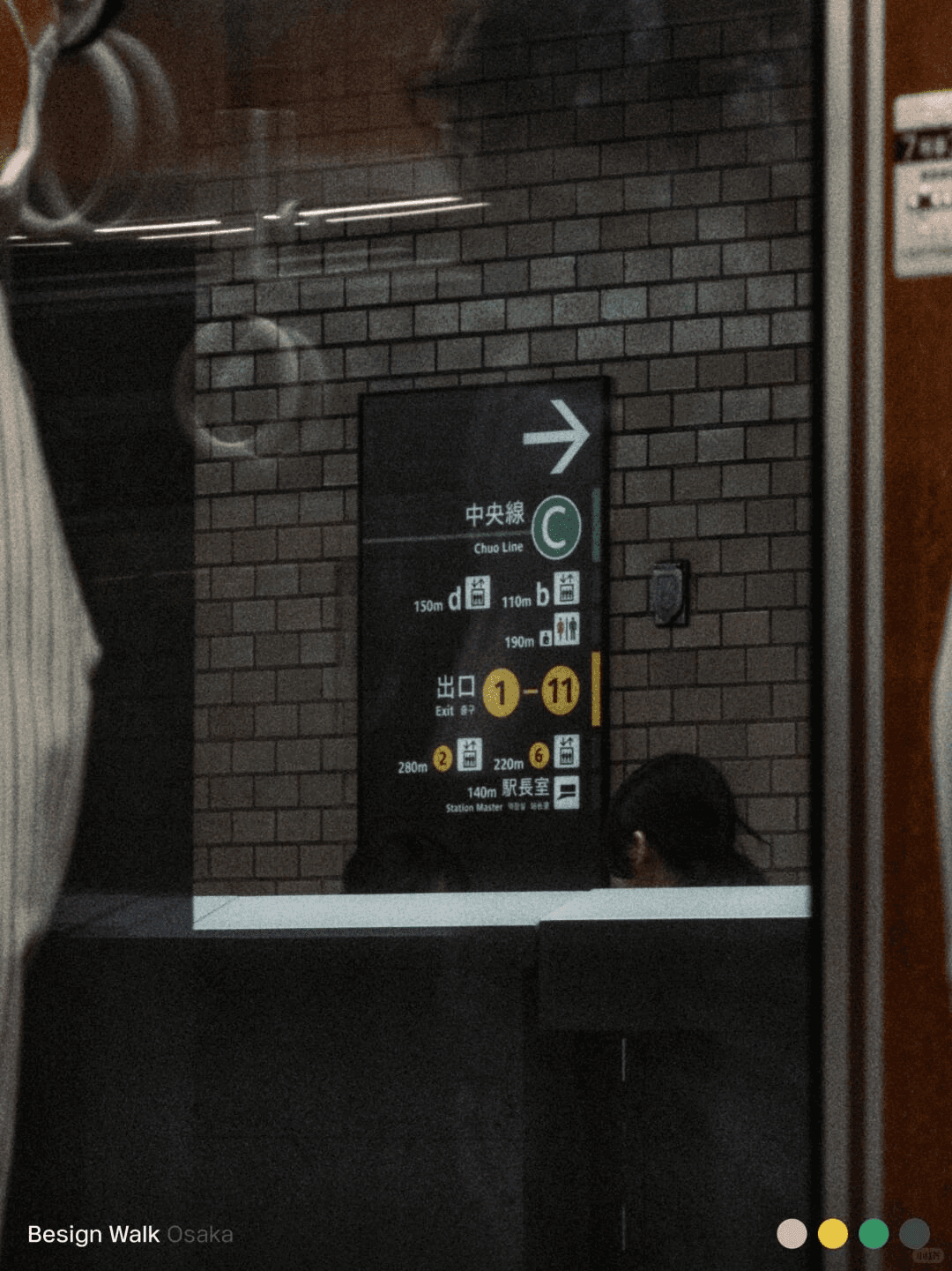
大阪公共交通系统的导视设计:通过深色底配高亮文字的高对比度组合,确保乘客在快速移动中也能迅速获取方向信息。
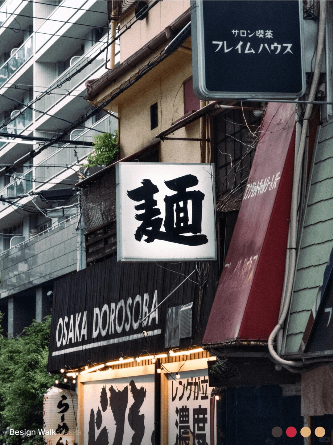

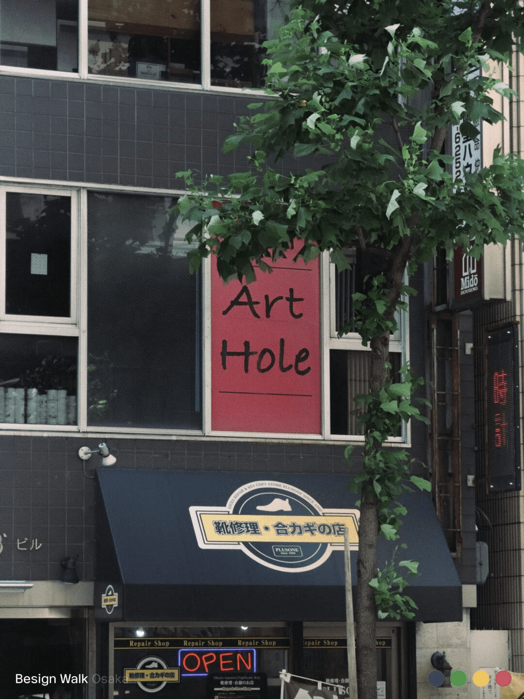
大阪街头的许多小店招牌多采用风格化的字体搭配纯色背景,不加多余装饰,精准传达个性。
In early June, the Besign team traveled to Osaka, Japan, for an urban strolling design observation. From the signage systems in subway stations to the signs of street shops, and the labels on public facilities to the packaging design of convenience stores, we tried to capture the design philosophy that this city reveals in its daily life.
Wayfinding design of Osaka's public transportation system: Using a high-contrast combination of dark background with bright text to ensure passengers can quickly obtain direction information even when moving rapidly. Universal graphic symbols and numbers (such as "100m") replace multilingual text descriptions, reducing the comprehension barrier for foreign visitors while avoiding information overload. The color bands and directional cues on handrails are also meticulously integrated into the movement logic. This precise balance of efficiency and universality is not just about aesthetics but a care for all individuals.
Many shop signs on the streets of Osaka use stylized fonts with solid color backgrounds, without unnecessary decorations, to accurately convey brand personality and functional positioning. Urban infrastructure such as traffic light control boxes are not overlooked either, with stickers using monospaced fonts to label numbers for both maintenance convenience and neat consistency, reflecting the "visible efficiency" and the "invisible thoroughness" in Japanese design.
In convenience stores, food packaging presents a nearly engineered aesthetic of information density. Distinct color divisions, clear primary and secondary text hierarchies, and unified layout logic allow consumers to make judgments and choices in a matter of seconds. This "high information + high order" combination is the most effective communication method in high-frequency consumption environments.
In Osaka, design exists beyond "beauty"; it strives to be better understood and more naturally used. It lacks superfluous ornamentation but expresses respect for publicness and meticulous care for people in every appropriate detail.
Besign will conduct more design strolls in various cities to explore design cultural styles of different regions.


