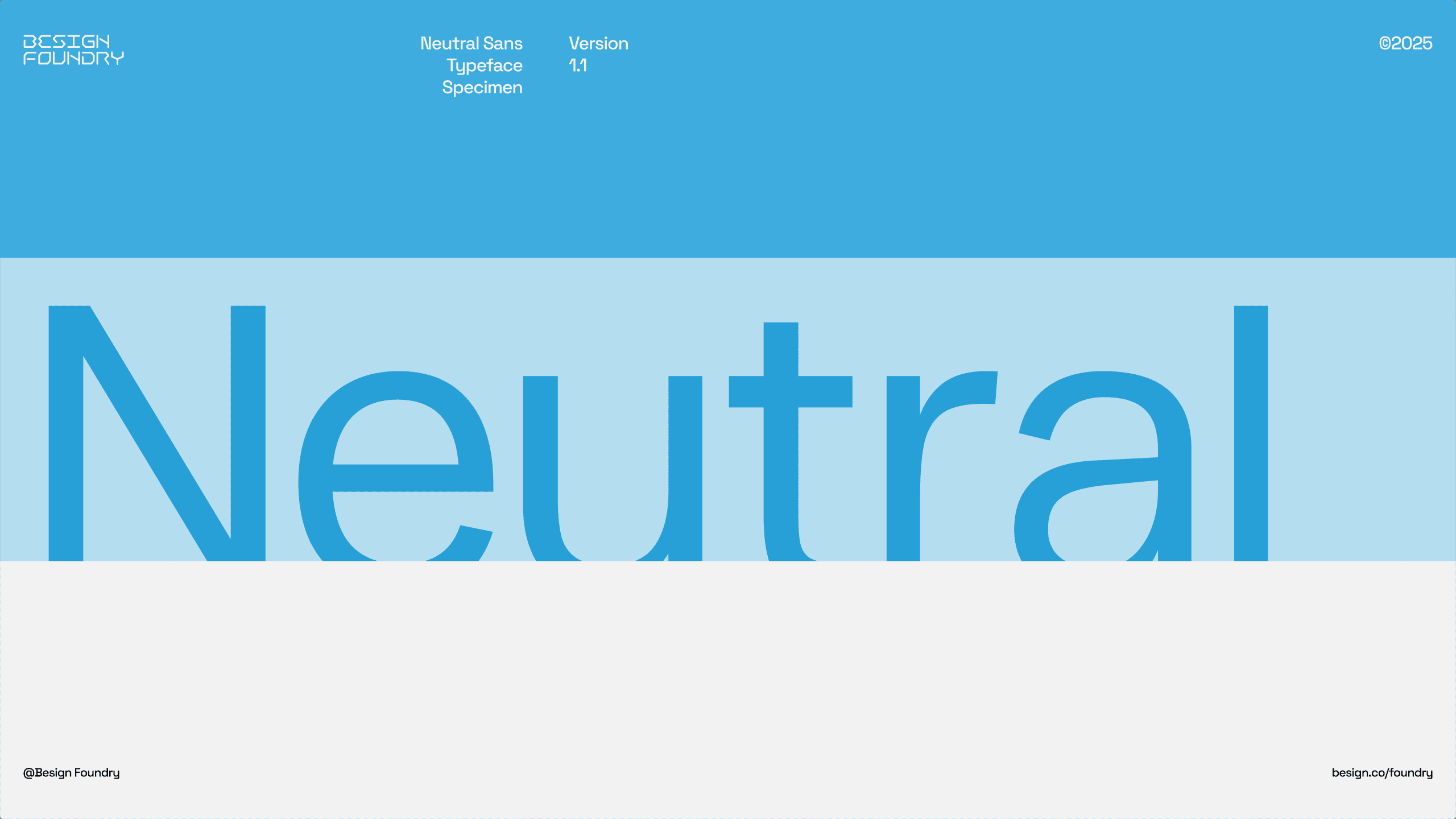
Neutral Sans
T
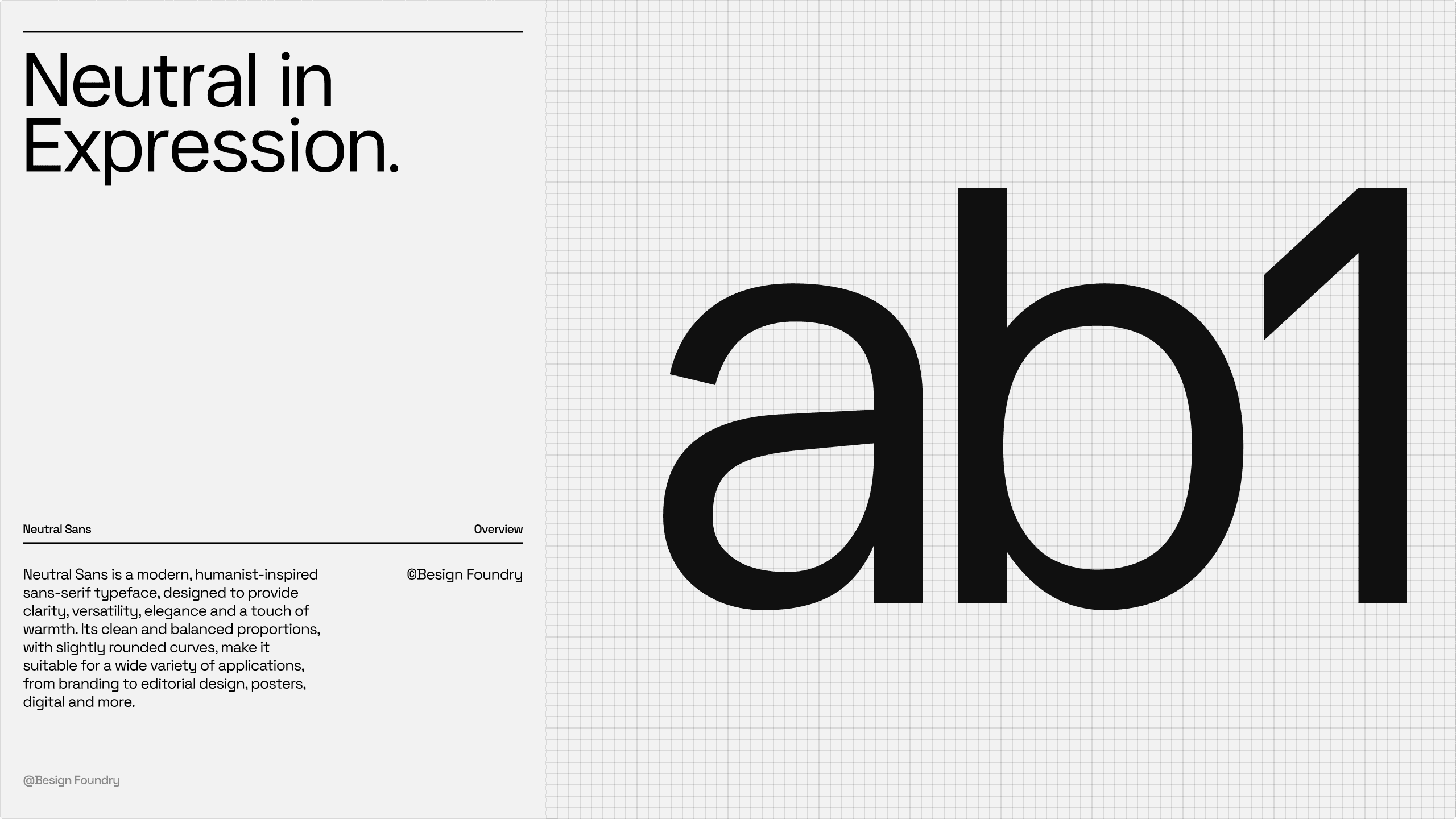
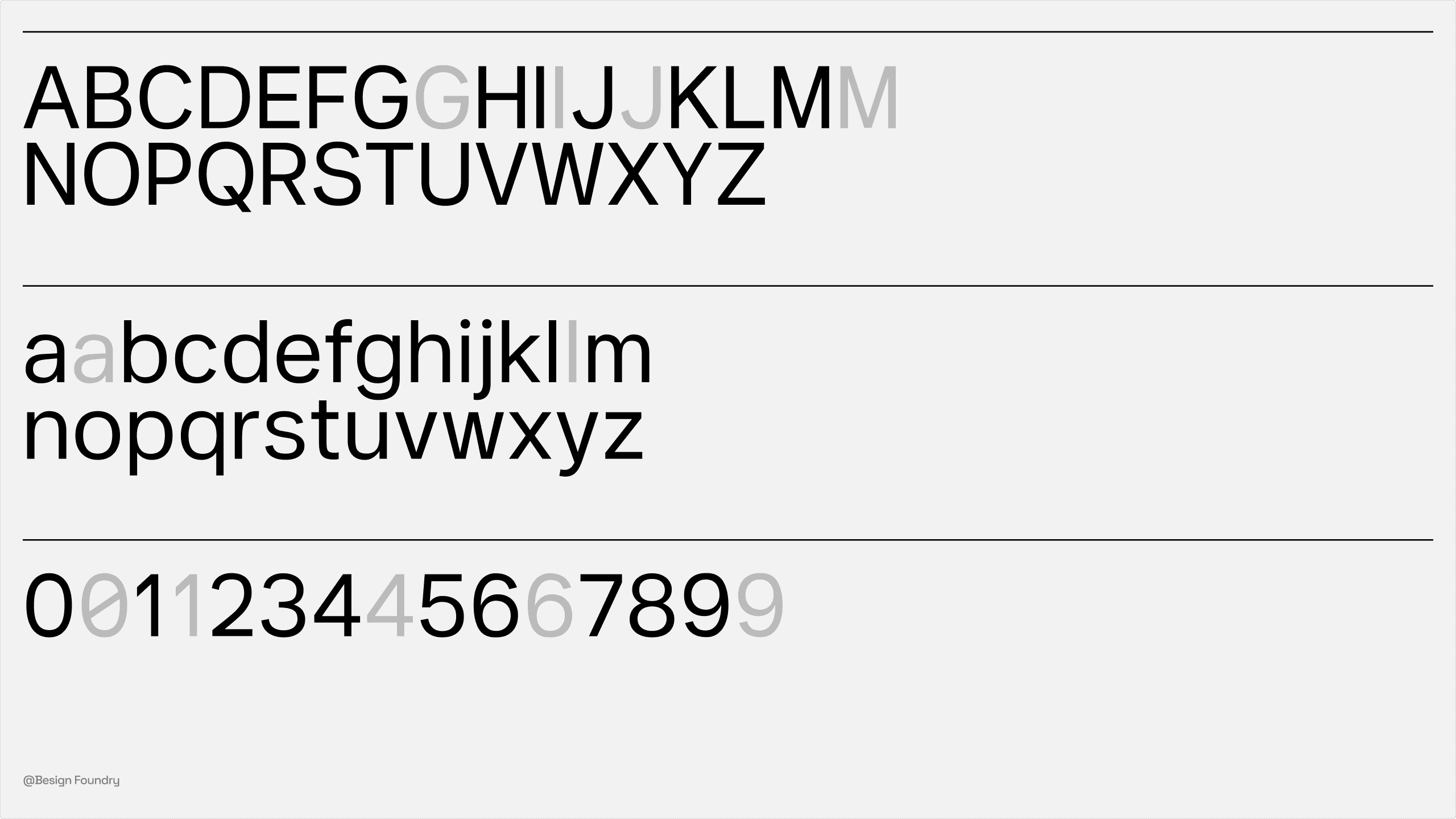
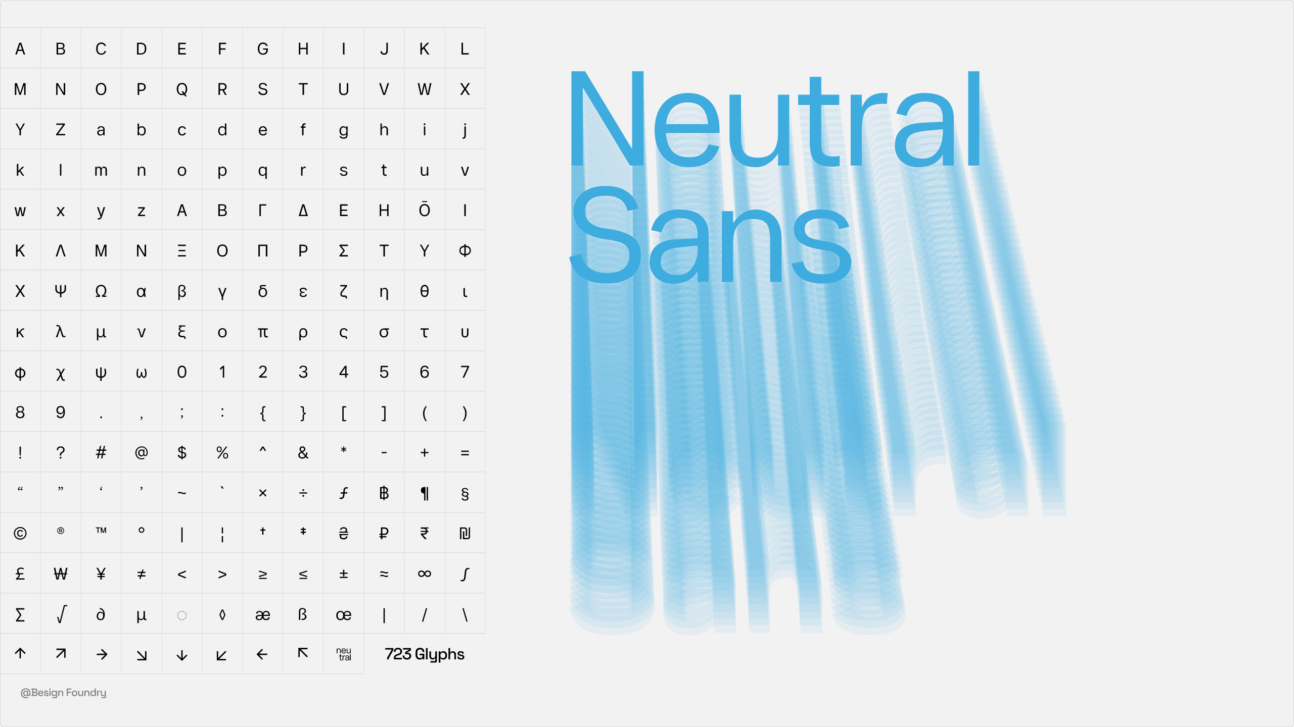
Neutral Sans incorporates humanistic serif elements, giving the typeface more vitality and warmth.
Compared to traditional modern sans-serif fonts, Neutral Sans has fuller bowls and more natural curve handling, avoiding overly mechanized coldness. Its relatively tall lowercase letters enhance readability, maintaining clarity even in smaller text. In both detail handling and overall structure, Neutral Sans emphasizes a comfortable visual and reading experience.
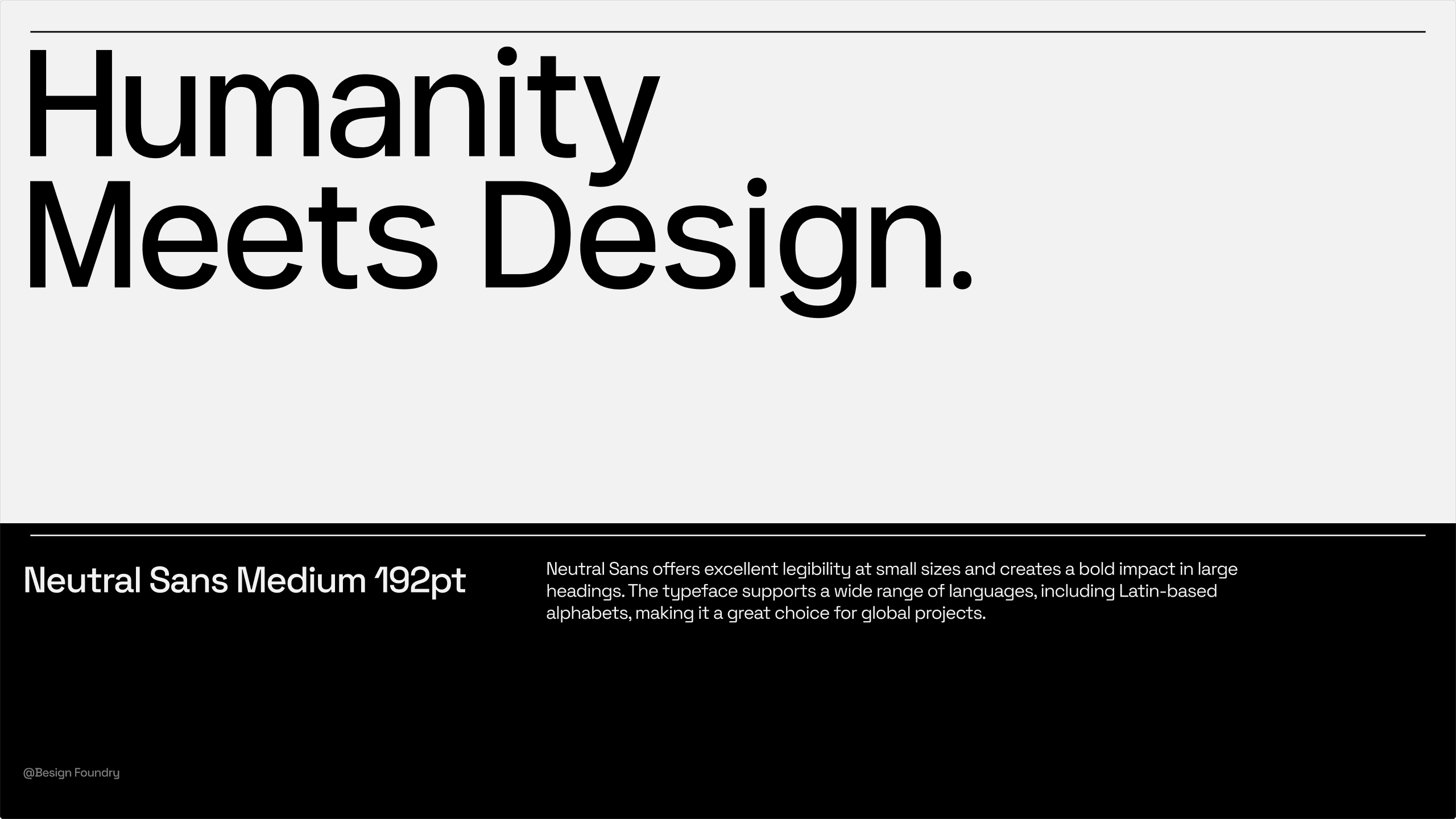
Neutral Sans features beautifully full curve details, making it particularly suitable for large-size display applications of short text. It excels in scenarios requiring strong visual impact such as headline design, brand identity, and slogans. Neutral Sans not only stands out in display typography but also brings a unique style to logo design and advertising. Designers can easily create a visual effect that is both modern and humanistic, meeting diverse creative needs through it.